top of page
COMMISSIONED WORK


The logo on the left was created for a friend's personal training business. The image o the right was for a friend who's rabbit passed away. Both images were created digitally in photoshop.
PERSONAL WORK
Digital Painting Studies


These two images were from my first class in digital painting. I have always ben critiqued as being "too graphic" with my aesthetic and you can definitely see that I sometimes have trouble with strictly realistic looking things. However, in this digital painting class I grew a lot and learned how to pull back my graphic aesthetic. I still end up enjoying my work more with graphic expressive lines and tend to add them or keep them on in my own work, like you can see in the portrait here.
Figure Drawing


These images were drawn in my figure drawing class at the Academy of Art University. That class was really a defining class for me as it taught me so much about anatomy and ultimately helped shaped the decision to start character rigging. This knowledge has stuck with me in my art and rigs and I know see how much I have improved from this class.
Graphic Illustrations


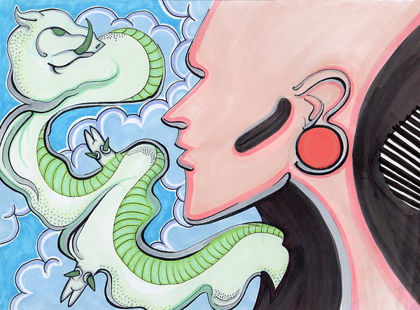
Images like this are a perfect example of my "graphic aesthetic". I often don't work with color but when I do it is bright, bold, and saturated color next to sharp thick black outlines. When I work with gray-scale images I like to play with mixing values and creating dimension next to bold outlines.
"Pen and Ink, and sometimes pencil'"


Lastly, these images are what I consider my spin on pen and ink drawings. I often use fine tip markers to do cross-hatching and line work as a way to create texture. In the image on the left I took about 20 hours painstakingly creating ever line in the demon's face and hair. Then with the aliens on the right I use a combination of both pencil and fine tipped pen to create cross-hatching shadows on their form.
bottom of page
